Color is the visual perception characteristic of things we describe by assigning various names. The physics of colors is very complex, involving a gamut of things like wavelength, absorption, emission, the functioning of our eye, and many others. From the point of using these colors daily, we will restrict the article to not going into the physics of the colors.
Colors add spice to things, giving them a different dimension and meaning altogether. Without them, the world is boring and definitely all black and white.
The guy has a colorful personality - You know what that means.
Color theory in itself is very vast, but one should know the terms in it. Below are some of the terms commonly used in color theory:
Primary Colors
Red, yellow, and blue is the primary colors. You cannot make these colors by combing any colors.
Secondary Colors
These colors are made from a combination of primary colors. Orange, green, and purple are secondary colors.
Tertiary Colors
When we mix primary colors, we get tertiary colors.
Some examples are:
- Mixing of red and violet gives red-violet
- Mixing of blue and violet gives blue-violet
- Mixing of blue and green gives blue-green
- Mixing of yellow and green gives yellow-green
- Mixing of red and orange gives red-orange
- Mixing of yellow and orange gives yellow-orange
Luminance
Luminance is the amount of light emitted by a flat body surface per unit area. You can understand it as the difference between dull and vibrant personalities. The color is brighter with more luminance, and it will look.

Contrast
When we compare the difference between the luminance of two colors when placed together, it is called a contrast between the colors. This comparison can label one as hot color and the other as cold color.
Contrast plays a major role in website development and graphics design as their combination brings out different elements.
Complementary Colors
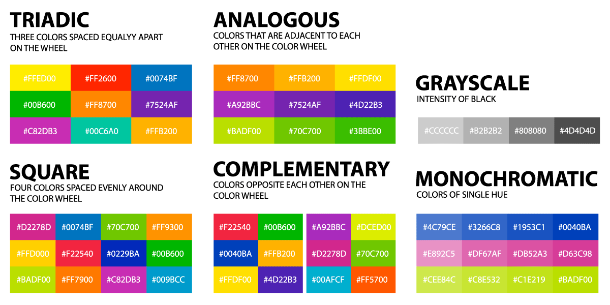
All colors do not compete with each other but support them by bringing out the best in one another. On the color wheel, they sit next to each other. They are used in compositions to bring excitement and make the other color more vibrant than it is.
Neutral Colors
These colors are also called earth tones and do not usually appear on the color wheel. Some neutral colors are black, white, grey, beige, brown, etc.
These colors stand neutral to other colors and have an identity of their own, you can use yellow, red, green, or any other color with this neutral color, and the neutral color stays neutral.
Warm Colors
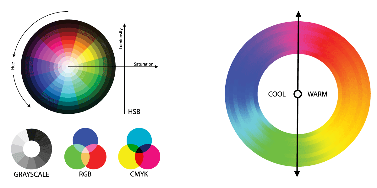
Warm colors give us a warm feeling when we look at them. These colors are red, orange, yellow, and others in their range. These colors remind us of the sun or fire and feel to emit out towards you, thus giving a warm feeling.
Cool Colors
These colors give us a cool feeling when we look at them. These colors are blue, green, and purple in this range. When looking at these colors, you might feel the colors recede from you, unlike warm colors where the colors seem to come towards you.

Color Scheme
A color scheme is the combination or choice of colors that one uses. Repeated use of the same colors keeps the meaning and aesthetics uniform throughout. It impacts the mood of the user subconsciously.
Although subjective, there are some set ways of getting color schemes. Let's look at the three most successful color schemes generally used.
Triadic
This color scheme uses three colors separated by 120 degrees on the color wheel. On the website, You can use one color for the background, another for content, and the last for navigation or call-to-action buttons.
This color scheme is safe as it does not use contrasting colors but uses colors that do not compete.
Tetradic
This color scheme uses four colors - two complementary pairs. The colors in these combinations are very difficult to harmonize as it makes the color palette too colorful, and finding a balance can be difficult. However, it is also the most rewarding if done well.
Analogous Colors
These colors sit next to each other in the color wheel, and their color wavelengths are closer than any other colors. These colors work in harmony with each other.
A typical example can be red, orange, and yellow. These three colors in any composition will not compete. If you place blue in the same composition, it will compete due to its contrasting nature.
Monochromatic Colors
These are shades and tints of the same color. These shades are made by mixing them with different quantities of white or red to get a light or dark shade.
These monochromatic colors are used to give a uniform sense of the composition.

RGB and CMYK Color Model
RGB and CMYK are two prime color models used everywhere. They have different ways of looking at the colors, and their usage depends on the device itself.
RGB Color Model
RGB stands for Red, Green, and Blue.
This color model is additive as combining these colors (secondary, tertiary, and so on) gives different colors that You can use. RGB is used primarily for websites as the color comes out easily.
You get white if you mix red, green, and blue colors of equal volume. Newton's disc is another example of mixing.
CMYK Color Model
The full form of CMYK is Cyan, Magenta, Yellow, and Key (Black).

This color model is subtractive and uses white as its background. The ink subtracts colors from the white light to give the CMY of the color model.
- White light minus red gives cyan.
- White light minus green gives magenta.
- White light minus blue gives yellow.
CMYK color model is used primarily in printing to give deep colors and uses fewer ink pigments.
Colors are one of the most crucial components in websites, graphics, and print. They help us shift the viewer's focus and guide his view. It also enables us to highlight the call-to-action functions in the website and graphics. If you are looking for any advice on the color schemes of your website, feel free to connect with us.


 Website Designing Company In Delhi
  Guest Post
  Ecommerce Website Development In Delhi
  Wordpress Website Development
  Laravel Developer
  Node Js Developer
  Ecommerce Seo
  Technical Seo


